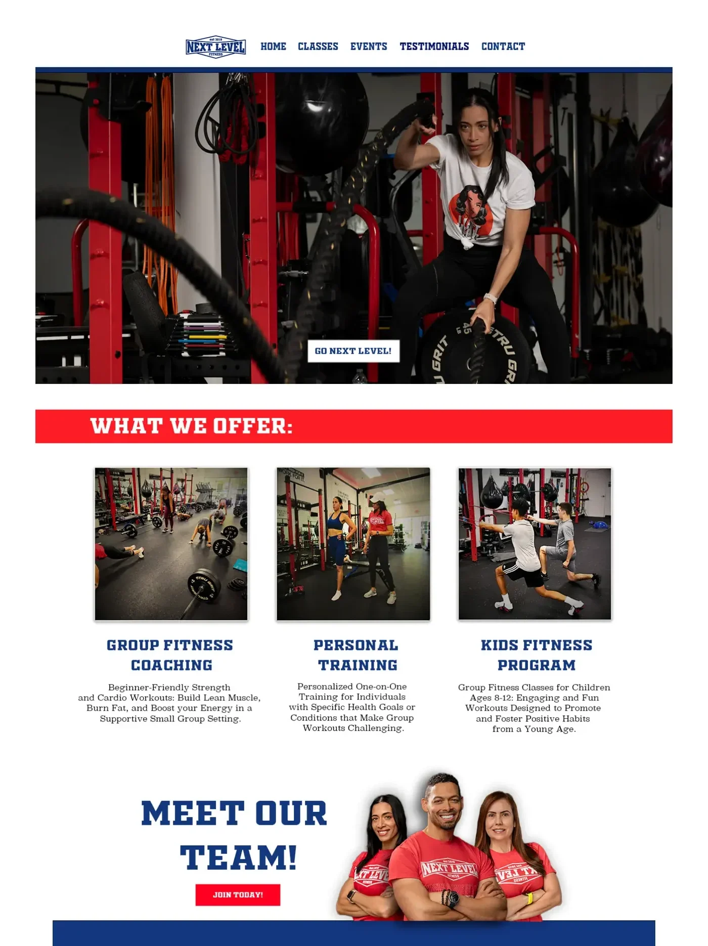
A high-energy website experience designed for a local fitness brand, combining strong visual hierarchy with clear pathways toward programs, coaching, and membership.
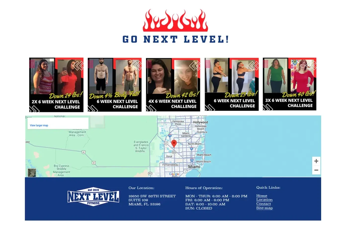
Built to turn attention into action.
The website was designed to communicate energy and professionalism from the first interaction while making the path toward joining a program simple and immediate.
Strong red, blue, and white contrast creates a recognizable visual system throughout the experience. Bold typography, structured content, and clear hierarchy help visitors quickly understand the brand, its programs, and what to do next.
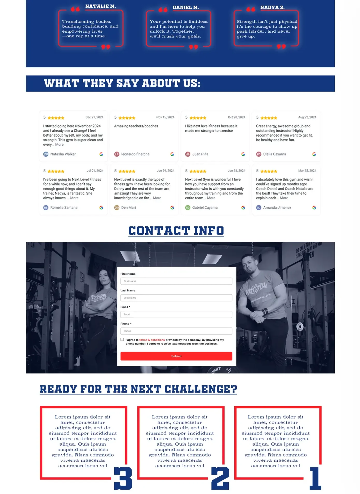
Testimonials, team highlights, and transformation imagery reinforce credibility throughout the experience. The result is a focused digital presence designed to transform interest into potential clients.
Bold typography and structured sections create a clear path through the experience.
Testimonials, transformations, and team content establish credibility around the brand.
Clear calls to action guide visitors toward programs, coaching, and membership.