A bold energy drink identity built around intensity, movement, and a sharp visual language designed to stand out in a highly competitive category.
Energy you can see.
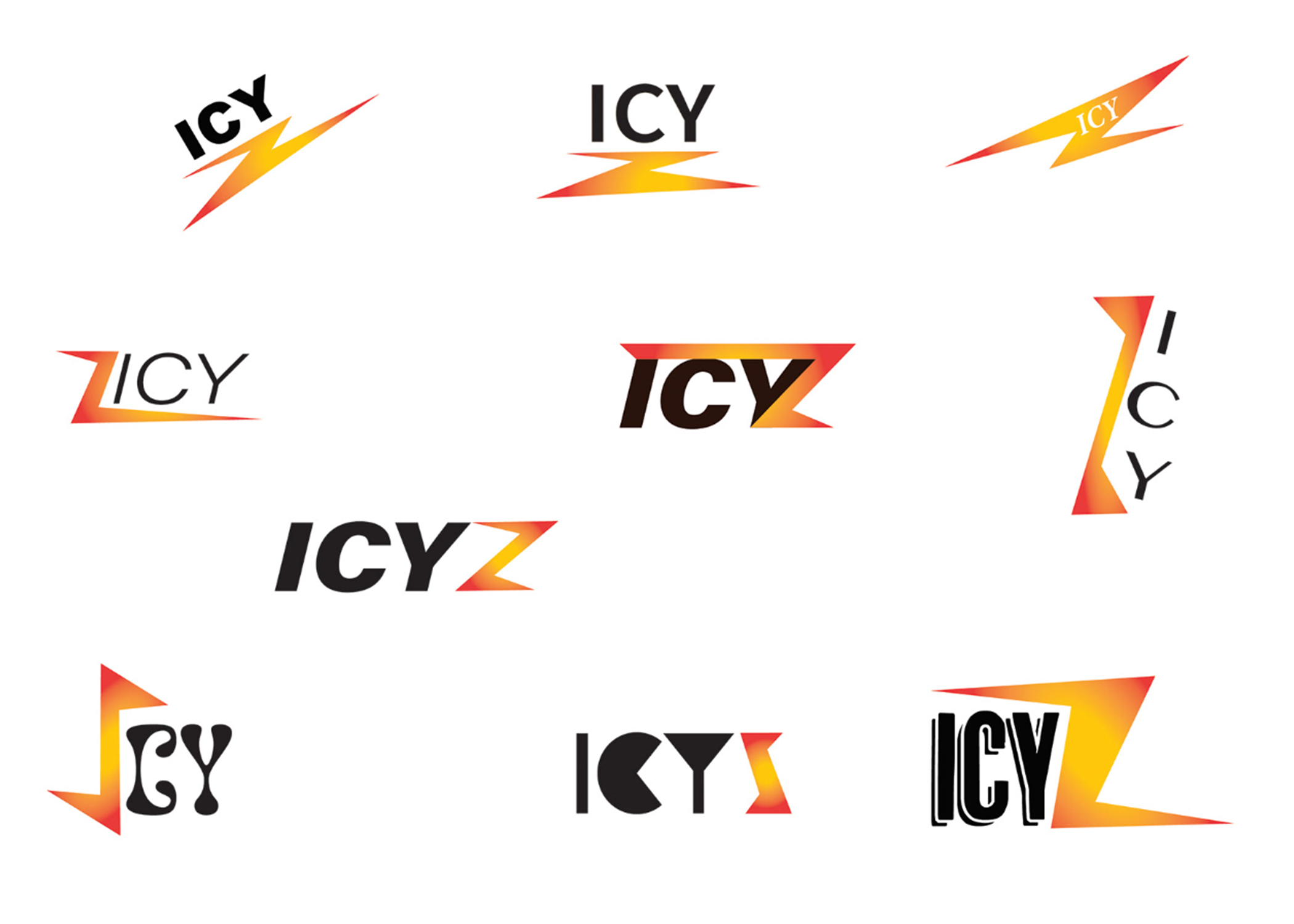
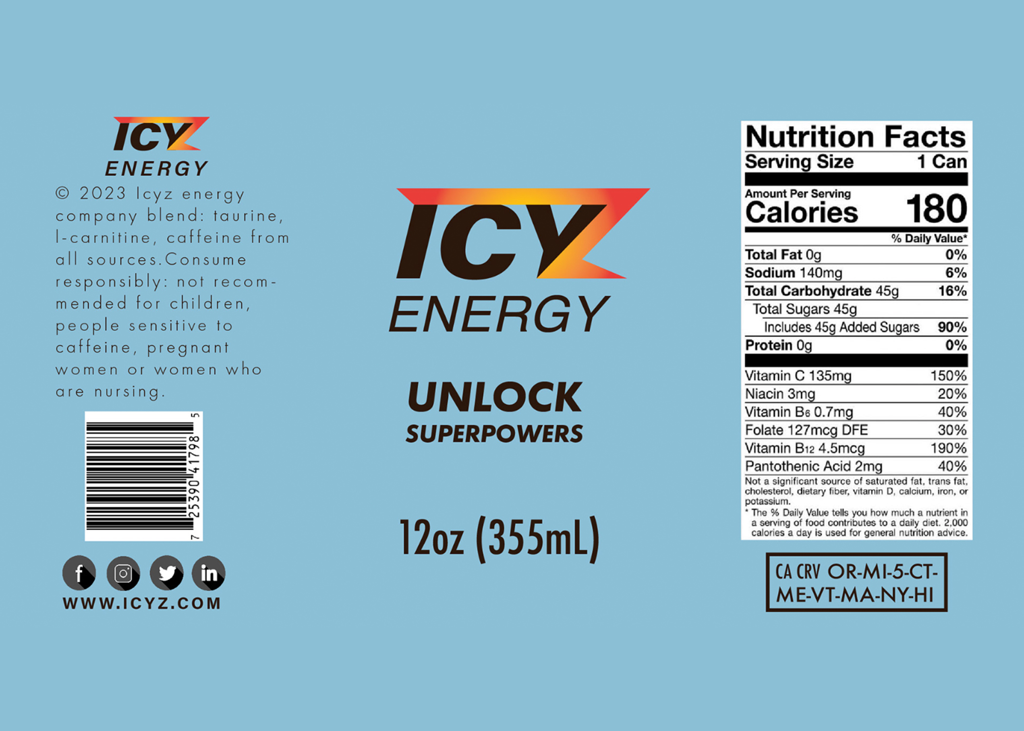
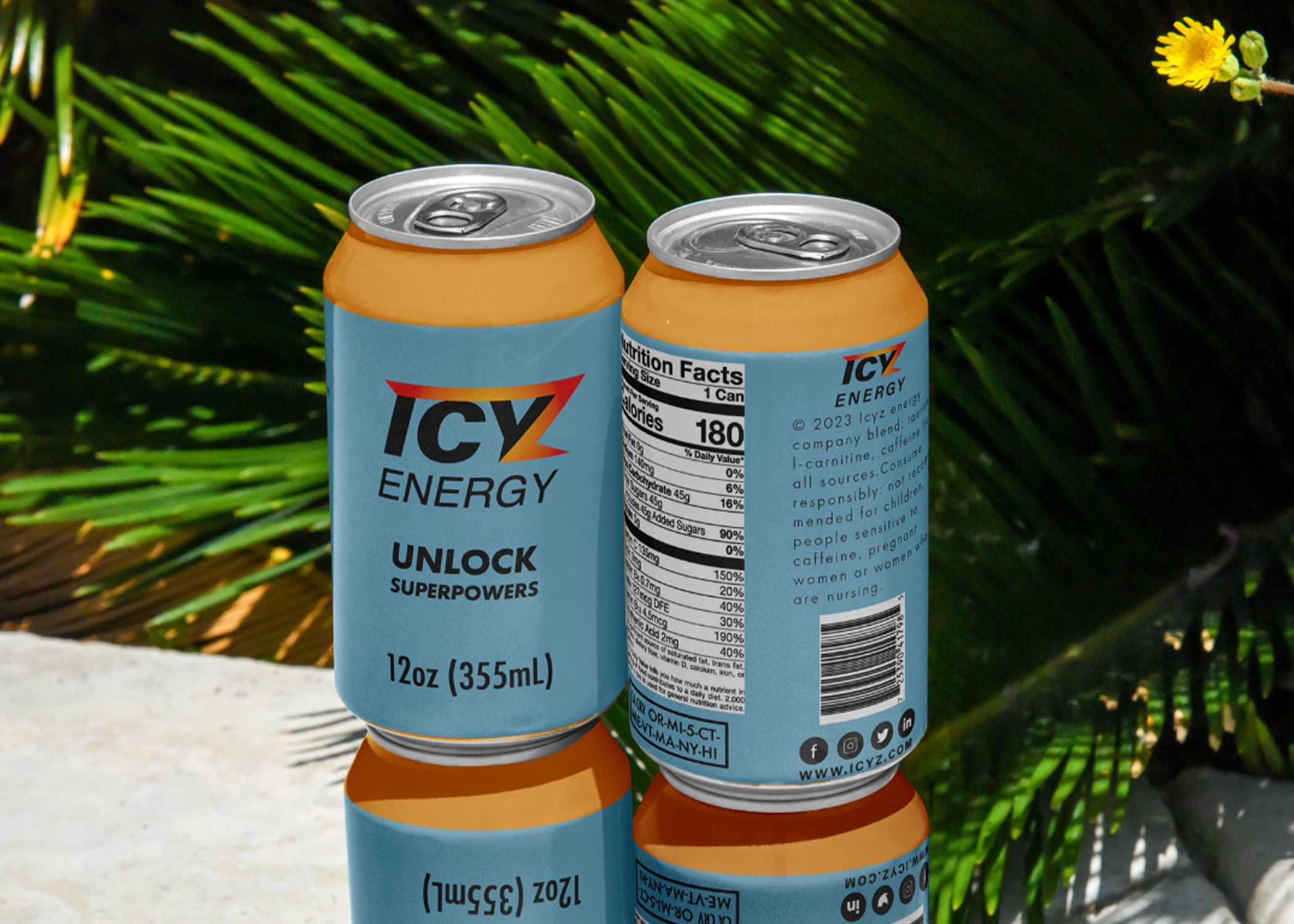
IcyZ was designed to translate the feeling of energy into a visual identity that feels immediate, intense, and recognizable.
The system combines bold typography, high-impact imagery, strong contrast, and dynamic compositions to create a brand language capable of competing for attention both on the shelf and across digital environments.
Rather than treating the packaging as a separate element, every application becomes part of the same visual system. The result is an identity designed to feel fast, confident, and unmistakably IcyZ.